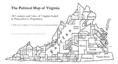
I stumbled across this today on the TheElectoralMap.Com. The site is old and hasn't been updated in a while, but it has some great cartographic gems. This image above is a bit hard to read, but it shows Virginia counties and cities scaled to their proportional population.
When viewed in this geometric format with mostly sharp corners and flat edges (as opposed to the more fluid cartograms) it is really easy to see just how large the Northern Virginia and Newport News/VA Beach areas are. This would be especially insightful if we overlayed yesterdays presidential election results. When you look at the standard CNN style map of VA counties it looks all red and it's hard to tell how Obama won. Using this view of Virginia counties the large democratically leaning population centers would overload the map and paint a clearer picture. I'll spend some time over the coming days to see if I can modify this with the election results. Stay tuned!
No comments:
Post a Comment