Welcome

a simple blog about political maps, cartograms, and anything else cartographic

Wednesday, November 28, 2012

Where did your Thanksgiving turkey come from?

Image Courtesy of Malene Thyssen
Ever wonder where your turkey comes from? How about the origins of other Thanksgiving staples like cranberries, sweet potatoes, and green beans?

Thanks to the guys at ESRI you can now find out! Using USDA data from 2007, ESRI created a pretty slick map to point out where these popular Thanksgiving items come from. Each item is mapped separately to avoid a cluttered look, so you'll have to click through four to get the full picture. Everything is displayed in a proportional symbol format, with the symbol of choice being simple colored circle and the unit being a county. Clicking a county will bring up a pop up that allows you to see how many turkeys were sold and acres of sweet potatoes, green beans, or cranberries were grown for the county.

Go take a look at check it out for yourself here. Some of it is pretty obvious, but who knew that the vast majority of cranberries were grown in four states?

Tuesday, November 27, 2012

Vanishing Islands - Google Maps

Sandy Island in Google Maps - It's the "grain of rice" at the northwest corner
The story of Sandy Island, the mysterious Coral Sea island that may or may not exist, has been all over the news recently. To make a long story short, a group of researchers in studying plate tectonics decided to stop by Sandy Island recently to check it out. The island had piqued their interest because it was not on their navigation charts of the area, but popped up on Google Maps and Google Earth. 
Sandy Island in Google Earth  - It's the black hole on the left 
After what I can only imagine was a drunken night of sailing they arrived at the "island", which turned out to be nothing more than the open sea. A quick Google search of the subject will return a long list of results attempting to explain why the island displeasure or never even existed. Really, I don't care. The important lesson here isn't what happened, but to understand that maps, even by Google, are never perfect. They are influenced by people, culture, the past, and technology.

I wonder how many other islands are mapped but don't exist. More importantly, how many might exist that have never been mapped? 


Monday, November 19, 2012

Weekly Top Media Maps - 11/18/2012

This one is a day late because I was celebrating the Redskins route of the Eagles yesterday. This weeks maps deal with conflicts in the Middle East and Black Friday.

1.) Dreading Black Friday? Smartphones to the rescue! - If you plan on shopping this Black Friday you might want to read this article first. You can use your smart phone to map out the most efficient shopping route, complete with "in stock" notices from stores like Macy's and Walmart.

You can even use your phone to get a better deal. Retailer are starting to catch on to the ever so popular "show rooming" technique, where a shopper views an item in store and then buys it cheaper at an online shop. Many of them now offer price matching to online store prices as long as you show them the online price. Find what you want, find it cheaper online, bust out your iPhone and get the best of both worlds; the best deal AND you can walk home with the goods immediately.

2.) Gaza Conflict - An in depth article about the ongoing violence in the Gaza strip. The BBC uses multiple maps to demonstrate where Israeli air attacks are occurring, where Gaza based rockets are hitting, and the range of various rockets available to Hamas. If you need a primer on the current version of this never ending crisis then this article is it.

3.) Iran Fires at US Drone - This Washington Post article tries in vain to identify where a US drone was targeted by Iranain aircraft two weeks ago. The drone wasn't hit and returned to a US base safely. The author based his "shooting area" on comments made by US officials to CNN.


Wednesday, November 14, 2012

Google's 100,000 Stars

If you get a chance head on over to the Google Chrome Experiment - 100,000 Stars website. It only works in Chrome, so make sure you don't use IE or Firefox.

The experiment, just released today, is a virtual tour of our universe. There is a "guided tour" function and you are allowed to freely roam about. We always hear about how large our universe is, but seeing it displayed in this format really shows just how small our planet, and ourselves, really are.

Be careful though. Not only is this sight visually appealing, but you can click most galaxies, stars, etc for more information. The extra information, amazing graphics, and the cool soothing music will trick you into spending far more time than you originally intended roaming around the galaxy. You've been warned!

Tuesday, November 13, 2012

Slave States for Romney?


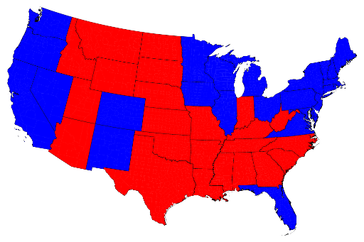
Today I came across a post on Alternet.org about the 2012 election and the divide between blue states and red states. The post suggest that the red/blue divide is among the slave state / free state divide during the troubled times of the Civil War. It presents a map similar to the one below as "proof".
Basically they are dead wrong. Anyone who spent half a class awake during US History 101 knows that Florida was certainly part of the confederacy and was a "slave state". Virginia too. On the other hand, West Virginia and Indiana were part of the Union. Furthermore, everyone knows that election maps like the one pictured above are pretty misleading because they force states into an all or nothing disposition. This is how our electoral college system works, but it is not how our countries politics truly map out. 


Here is the same data but shown by county, not by state. Clearly our countries politics are not drawn by social and political views that are 150 years old. If we were to do this on a smaller unit (perhaps census tract) we would find an even more purple country with no real dividing lines between red and blue. 

The article is interesting, although odd, and the author tries to make a few attention grabbing points. It's worth the read, but ignore the titled and the graphics unless you want to be mislead. 


Sunday, November 11, 2012

Racist Election Tweets


Courtesy of FloatingSheep.org
Check out this post over at the FloatingSheep.org. Using a methodology they describe in detail in their post, the guys over at FloatingSheep determined how many racist tweets were posted after the presidential election. 

They found 395 "hate tweets", geolocated them, and then mapped them out on a per-state basis. I'll let you take a look at the map and draw your own conclusions, since this is a kinda touchy topic. 

Weekly Top Media Maps - 11/11/2012

This week's top media maps mostly deal with the US presidential election.

1.)  MotherJones.com cartograms- This is one of the first 2012 presidential election cartograms I've come across on a somewhat "mainstream" media site. Kudos to MotherJones for writing the story and M.E.J. Newman for creating the maps. Not only does this have your classic election map displayed as a population based cartogram, but it also has this awesome morphing cartogram video showing how election money has influenced the 2012 campaign. The video pushes this to this weeks number 1 spot.


2.) Google Maps in iOS 6 - Not exactly a use of maps into today's media but this takes the number 2 spot anyways. Since Apple's map debacle the geographic community, the tech community, and pretty much anybody with an iPhone has been waiting anxiously for Google to release a Google Maps iPhone app. Early  this week the rumor was that Apple would reject the Google Maps app. Bad news!!!

Thankfully it looks like Apple will approve the map so everyone can promptly bury their Apple Maps icon on their 9th screen and put the Google Maps app on their first page.

3.) Democracy in China - This really should be the in the number 2 slot, but I'm an iPhone user so it got bumped down. TheAtlantic.com did a great article with an accompanying map discussing a hypothetical election in China between the ruling communist party and the Kuomintang, which is the party that rules Taiwan. Anybody with an interest in international politics should take a look at Atlantic's post.


Saturday, November 10, 2012

2012 Geography Quiz

globe2.gifThe Chicago Tribune just put out their 2012 geography quiz. A mix of fill in the blank, true/false, and multiple choice quetions as well as a "match the map" section combine to create a pretty tough quiz.

Give it a try and see how well you score. Answers are posted on the bottom so don't scroll down until you are done!

If that ones too hard head over to Lizard Point and see if you can correctly locate the top 158 major US cities. If you think you know US geography this test will put you in your place.

Thursday, November 8, 2012

2012 Election Results!

The 2012 Electoral map results as of Wednesday morning. Florida is still too close to call. Map created on Real Clear Politics
Map courtesy of RealClearPolitics.com


Now that the 2012 election results are in every self-respecting news network has the generic "electoral map" somewhere on their front page. It's basically a requirement for the next few days until people stop caring and the news moves on to the next best topic. This time of year lends itself perfectly to cartographic reviews because every news outlet is displaying the same information, just in slightly different ways. Here is what I think of a few.


1.) Politico has a great interactive map that allows you to drill down from the state level to the county level, and really see how each area of the state voted. It will also display the percent of the population and raw numbers that voted for each candidate. I have three gripes. First, the colors are a bit too vivid for my taste. They tend to distract me from the subject of the map. Second, for whatever reason they used a very detailed coastlines. I love detail, but the map purpose suggest that I don't need to see every island off the coast of Alaska. Lastly, and this is a common theme, Politico has decided to leave Florida as "undecided". I understand trying to avoid making wrong assumptions, but Obama won.

2.) Google is getting more and more into the geospatial realm, and here they put out a great election results map. First, it's stupid fast and is built on top of the Google Maps application. Colors are transparent overlays so you can see who won in each state but still see cities, major roads, and water bodies. Just like political each state is interactive and drills down to county level results. Lastly, Google is a bit more informed than Politico and correctly has Florida in the Obama camp. This is probably the best overall map.

3.) The best is from the Huffington Post. It has a great color scheme that is subdued yet vivid enough to tell the story, uses elegant white lines to outline shape polygons, and doesn't dance around the fact that Obama has indeed won Florida. Basically, it's similar to the Google map but uses awesome white outlines. Huffington Post wins!


Wednesday, November 7, 2012

Cartogram of Virginia


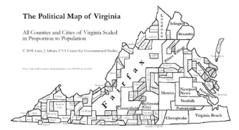
I stumbled across this today on the TheElectoralMap.Com. The site is old and hasn't been updated in a while, but it has some great cartographic gems. This image above is a bit hard to read, but it shows Virginia counties and cities scaled to their proportional population.

When viewed in this geometric format with mostly sharp corners and flat edges (as opposed to the more fluid cartograms) it is really easy to see just how large the Northern Virginia and Newport News/VA Beach areas are. This would be especially insightful if we overlayed yesterdays presidential election results. When you look at the standard CNN style map of VA counties it looks all red and it's hard to tell how Obama won. Using this view of Virginia counties the large democratically leaning population centers would overload the map and paint a clearer picture. I'll spend some time over the coming days to see if I can modify this with the election results. Stay tuned!

Monday, November 5, 2012

CNN Election Map

I absolutely love playing around with the CNN Election Map. It's incredibly simple, political, and totally pointless - exactly why I love it. Give it a try and waste a few minutes trying to predict tomorrows election results. Can Mitt win without Ohio? Can Obama sweep the swing states? Who knows, but tonight is the last time you'll be able to decide which way each state swings before the results come pouring in tomorrow evening.

Here are my swing state predictions:
Nevada - Obama
Colorado - Obama
Iowa - Romney
Wisconsin - Romney
Ohio - Obama
Virginia - Obama
Massachusetts - Obama (ouch! Romney gets burned in his "home state")
Florida - Romney

Total Obama = 287 electoral college votes
Total Romney =  251 electoral college votes

Welcome President Obama to another 4 years!!